Friday, December 30, 2011

A Vapid Unbearable Lightness: Why Modern Architecture Struggles to Inspire Catholics

La Tourette Monastery by Le Corbusier  in
Eveux, France
Inspired by a recent visit to a Le Corbusier-designed Dominican monastery near the French city of Lyon, I've been thinking a lot about the interaction between Catholicism and modernist aesthetics.   It has little to do with whether the Church affects what designers create beyond filling the program.   Instead, I've tried to examine the architect's religion influences the Church's own self-image.  I've concluded that the Church, an institution that has been the guardian tradition and the patron artistic and architectural development in the West for almost two millennia, never could reconcile itself comfortably with Modernism. 

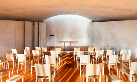
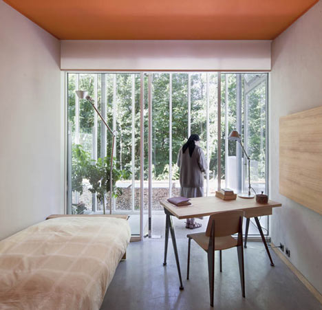
I was reminded of this when I shared with my brother news on the opening of a new convent and Visitor Center buried into the hill on which sits Le Corbusier's famous Notre Dame-du-Haut Chapel at Ronchamp.  The convent was but the latest creation of the contemporary master Renzo Piano, featuring architect's trademark manipulation of natural light, spatial simplicity, open views of nature and elegant detailing.  My brother seemed to shrug at these qualities, writing

 "Seems more like a fish tank with Ikea finishes than a cloister. I know natural light, rectangles, and windows are nice, but its openness and simplicity feel like some vapid unbearable lightness than a place of spiritual reflection. Zen monks might appreciate it more."

I replied that he seemed to have a very narrow idea of what constitutes a proper place for spiritual reflection, and that lightness and simplicity had a place Catholic doctrine.  I referred to him to a series of pictures  I had taken of Le Corbusier's monastery, wondering what he thought of his more 'Brutal' approach.  My brother elaborated:


"Ugh, these architects have no god. That thing (by Corbu) is hideous. Look, meditation takes place in the mind, but more in the soul. Christianity places the priority on man's soul transcending his surroundings, not blending with it (a la Zen). Man is large, not small. Churches should be ornamented and highly symbolic, teeming with life, not stark and barren. It all has to do with Being not Nonbeing. The church is a foundation, it's heavy, it imitates the eternal. It's not some flimsy plates of glass and concrete garnished with random primary colors here and there." 

Bedroom of Convent by Renzo Piano Workshop at
Ronchamp, France
Though there are indeed gaps in his argument that can be exploited, I think his overall opinion is respectable and shared by many of the Catholic faithful who possess a sophisticated understanding of their beliefs and how to translate them into sacred art.  Often such views completely contrast from many members of the clergy, who have more of an interest in revitalizing the church by embracing contemporary artistic trends than by responding to wishes of their flock.  The Dominican monastic order prizes scholasticism above all else, and finds it fully consistent to hire a leader at the forefront of architectural progress like Le Corbusier.  The nuns were probably thinking along the same lines, wondering less about how sacred life can transform architecture, but rather how architecture can transform sacred life.  Architecture in both instances is a stream of development independent of religion, part of an ongoing dialog on the nature of form, space and order.

Outside a few rare examples such as Ronchamp,  I sense that Modernism has failed to deliver an architecture  that connects with most Catholics and other traditional Christians.  Much of this has to do with fact that Modernism as a cultural movement is inherently atheistic as it is based on a secular materialist philosophy.  Even Renzo Piano admits as much, describing his client from the convent: "She has a profound love of architecture, of landscape, of sacred space – and even of people without religion, like me.  She wanted a place of silence and prayer. I said: 'I can't help you with prayer, but perhaps I can help with silence and a little joy."

Chapel at Convent by Renzo Piano Workshop,
Ronchamp, France 
And therein lies the crux of the problem: When one has done away with symbols, theology, and the act of worship, there's little else to inspire a credible work of sacred art or architecture.  Piano, like any committed Modernist, is left with little more than a preference for abstraction, technology  and  some vague nostrums about nature and  space.  For a Modernist, the point of architecture is to convey an image of maximum clarity, in which all elements are related by function and little else.  As long as a space is adequately sheltered and functions for the use of its occupants, there is no need for decorative flourish.  Piano is reduced to checking off boxes for the client's wish list, from the number of rooms, to furnishings, and to achieving a quality of 'silence'.  There's nothing all that particular about an architecture of silence--maybe  a dark room secluded from more socially active spaces.  Given the right palette of materials and details, any space can be turned into something contemplative.  But can this generic approach to design evoke much meaning beyond mere emotional states such as peace?

Sacred spaces achieve much of its effect by emphasizing mystery. This is at the core of any religion, in which divine truth is revealed beyond any logical or rational framework.  As is often said, God is revealed in mysterious ways, and the purpose of any sacred space is to embody this reality.  It is inherent that a secular space is completely  counter to this and thus adopts an architectural language devoid of mystery or even ambiguity.   Secular spaces instead embrace the language of the engineer, someone who works outside the world of art, poetry, and indeed of mystery, by solving problems with the most rational tools of math and science.  There is a lot of work that goes into making successful setting for secular activities, much of it having to do with the science of building, such as lighting, acoustics, and visibility.  There is also a tendency for generating phenomenological effect through technology, such as making walls highly transparent or reflective, surfaces either smooth or deliberately rough.  To the Modernist who puts its faith in technological progress, the more an effect can exceed what can be done by the human hand, the better.


La Tourette Monastery by Le Corbusier, Eveux, France
Such attention to a material's effects point to Modernism's essentially materialist philosophy on architecture. In sacred architecture, the building and the spaces within serve  to connect users to a deeper reality that transcends its walls. They function as a gateway from the material world to a spiritual realm--the focus is on the eternal, not the object that portends to represent it.  In a secular context like Modernism, the object is the thing itself, and all meaning is tied directly to that object.   Walking into a exemplary Modernist space, one is supposed to marvel at its lightness, smoothness and simplicity, attributes that are commonly summarized as 'machine-like'.  If one desires a more 'humanist' look and feel, the designer can instill a quality of 'roughness' by texturizing concrete, oxidizing steel,  and inserting warmth by using  natural materials such as wood and stone.  Industrialization gives us that much more control to generate a precise effect, and empowers the designers unlimited opportunities in experimenting.  At the same time, it diminishes the role of the craftsman, who throughout most of human history was the guardian in generating material effects, and in  many ways assumed the role of architectural detailing.  Machines take the human factor out of the art of making, thus producing something devoid of passion, feeling that imbues every man-made object.


Piano singles himself better than most of his contemporaries by his ability to reinsert the human touch in his design process. His architectural details are truly works of art and are usually the result of a distinct craftsman-like approach in generating them.  The name of his firm, The Renzo Piano Workshop, harkens back to the time when architecture was realized by stone masons, who would accumulate specialized design knowledge in the development of style details and templates.  Where Piano departs is the end result of his craftsman-like approach: highly refined, ultra-precise, machine-polished building systems and parts.  The structural connections in his projects are beautiful  and poetic pieces of engineering, much like Apple products, but like most industrial artifacts, they cannot express the ancient, primordial aspects of our humanity.  Is that necessary to fully immerse oneself the Catholic experience?
I believe so.  A fundamental assumption in Catholicism is that history is linear and that God was incarnated in the human form of Jesus Christ at a precise point in history to the point that the period before and after this event are neatly divided (BC vs. AD).  Its doctrines and liturgy are part of an evolutionary process that have taken place in the world for two thousand years, and followers actively partake in this history by participating in the mass.  For most Catholics, weekly mass is the only time that they are reminded that they are tied to humanity in throughout the ages, both in the past and the future.  This goes against 'modernity', or the idea that the times are so new and different that prior truths or solutions are irrelevant.  In Christianity, Truth is eternal, and the problems that afflict humanity are no different during the time of Christ than they do now. There is no 'new and improved'. Rather, the ideal was was established two-thousand years ago (the life of Christ) and no amount of social or technological advance (or regression) can change this. 
View of Crypt inside the La Tourette Monastery
by Le Corbusier

In addition, Christianity relies on communicating its ideas through allegories conveyed verbally in the Bible, musically in its music and visually illustrated in its art and architecture.  These are designed to make the message accessible to all people, as opposed to keeping revelations close to a self-selected elite.  The message has to be clear, the context must be provided and the characters believable.  Visually, this requires the use of lines and recognizable figures placed in a narrative relationship. These demands don't lend themselves well to abstraction, the modus operandi of the Modernist.   Abstraction is by nature open to individual interpretation; Christian revelation is not.  Abstraction is deliberately exercised by an individual, driven by their own desire to create original content; Christian subjects and themes are the content, with the artist sharing his visceral imaginings of truths he does not question (like most European art before the 19th Century).

This probably explains why many Catholics feel a certain frustration with the role played by modern music, art and design in today's church.  The music uses irregular folk beats, vulgar melodies and harmonies, and seem composed to bring attention to the songs themselves rather than acquainting singers to a more transcendent reality.  In contemporary Christian art, Christ is portrayed as a non-descript figure, and often times and rendered in an abstracted archaic style that is flat and lacks feeling.  The cross is abstracted to emphasize its iconic nature as a symbol, detached from any literal representation of what actually happened on the cross.  In most modern churches, seating is arranged as a theater in the round, focusing the parishioners' attention to the the priest, or the choir, rather than to God as manifested in an elaborately decorated apse wall or a ceiling pointed to heaven. This was vividly brought to my attention when watching the broadcast of Christmas mass from the Vatican--most of the camera shots showed details of the sanctuary's glorious interior and symbolic art, with the occasional view of the Pope.  Catholic worship is not about the mere men (priests) who help conduct its rituals but is instead is about how God is revealed in them by means of humanity's most outward expression of what lies within its soul: Art. When there is nothing meaningful or moving to look at, one is resigned to paying attention to a charismatic individual standing on a stage, tanscendent beauty is loss, and the Christian message takes on a banal delivery.

Chapelle Notre Dame du Haut by Le Corbusier,
Ronchamp, France
 Architects, a growing number of whom fall into agnosticism and atheism, often seem to forget this when visiting sacred yet Modern masterpieces.  Just because Le Corbusier's Ronchamp chapel makes some of my colleagues cry doesn't mean it fulfills its ecclesiastical responsibilities particularly well.  They are likely overwhelmed by the chapel's poetic mastery of form and light and how it provokes a profound yet undefinable emotional response.  I succumbed to this response myself when I went to Ronchamp as well when I toured  Le Corbusier's monastery of La Tourette.  I was taken aback by his buildings' abstract forms, its play with light, its vivid use of color, its sophisticated relationship to its site.  In the end, I didn't develop a more profound appreciation of Christian revelation, but a greater respect for mathematical proportion, abstract formal metaphors, primary colors and geometries--transcendent things nonetheless, but a bit too esoteric for most people.  La Tourette was clearly a more regulated composition compared to Ronchamp, which is probably why is probably why the latter provokes a more emotional response.  In  a sense, the chapel is Le Corbusier at his least 'modern' and more archaic, while his monastery is likely intended to feel more academicized due to that typology's tradition of being repositories for knowledge. Ronchamp's form sweeps up to heaven, its dark sanctuary enclosed in thick walls reminds one of a cave evocative of early Christianity, while its rounded towers mimick Mary in her veil, sheltering the church below. Though these moves aren't literal, there is just enough reference to the symbols and ideas of Catholic church that make this more approachable to average followers.

Church on the Water by Tadao Ando, Tomamu, Japan
This isn't to suggest that modern architecture can't achieve successful spaces for spriritual contemplation. Tadao Ando's Church by the Water is especially powerful, manipulating natural light and framing views that heightens the senses and fuses nature into the act of worship. The church is stripped of traditional Christian decoration, illustrations of bibical stories or saints, or any other reference to the history of the church. It works for those who wish to understand God through nature's primal elements and how they change through the passage of time. There is a sense of ignoring the human presence altogether, as it invites one to blend into the natural surrounding (as my brother's comment on zen indicates), which may work in more minimalist strains of Christianity and even Catholicism, but will leave many believers hungering for a place rich in narrative objects and a more fully enclosed communal response among people.   There is no altar to focus on, only a highly abstracted cross standing in a reflecting pond, which could have all sorts of meanings, but not one that concentrates the mind of the believer on Christ and his passion.

A truly inspiring space that uses a modern architectural language for catholic worship is extremely difficult to find.  While many architects simply choose to employ a historicist style for even newest churches, it is possible to address the particular characteristics of a catholic church while maintaining a modernist sensibility.  I submit a Cistercian chapel located not far from where I live in Irving outside of Dallas designed by Gary Cunningham. Long an admired designer in the area, Cunningham's work can be characterized as simple, straight-forward, and sensitive to materials. His award-winning residences follow a rather conventional contemporary style but he also is very accomplished in the art of adaptive reuse, in which he repurposes an existing building by carefully juxtaposing old and new elements.  This consciousness of how time plays a role in the way a building expresses itself is strongly manifested in the Cistercian chapel.  The space is enclosed in rough quaried limestone, cut in massive blocks and stacked in traditional running bond, which instantly strikes any visitor as reminiscent of the Catholic church's earliest Romanesque sanctuaries with their thick walls and small windows. Its wood roof floating above the nave takes the shape of a traditional ceilings found in these churches, while also resembling the underside of a ship (which is where the word 'nave' comes from). Spans are short, further emphasizing the weight of the stone, even as they maintain familiar rhythm suggestive of the old ambulatory aisles with the repetitive row of vertical windows.  It follows more of a classic basilica typology than the popular theatre-in-the round, which indicates a desire to focus on the liturgy as opposed to the priest. But more than merely echoing the churches of the past, this chapel appears as a direct architectural metaphor for the creation of the church itself: "And I say also unto thee, That thou art Peter, and upon this rock I will build my church...(Matthew 16:18)"  While obviously an abstract design, Cunningham manages to endow the chapel with an important phrase from the Gospel and thus Christian revelation.  Sleek details and delicate connections between the roof and walls betray its contemporary origins, but the way it highlights the split-faced texture of the rock wed the chapel to the church's long institutional history, and the countless number of people who dedicated their lives in building structures fitting to God's glory.

Cistercian Chapel by Gary Cunningham, Irving, Texas
And that, to me, is what is necessary for a compelling Catholic worship space--a connection not only with the divine, but just as importantly with an institution comprised of people throughout the ages. Its walls should reveal human intent, either through a man-made texture or through an ornament that is the work of genuine human input. Machine-smooth de-personalizes this experience.  As any human institution that is an essential part of catholic identity, it carries a rich artistic and architectural heritage that brings with it a kind of unassailable authority not found in Protestantism, which devalues the human institution in favor of interpreting directly from the Bible.  The result of of relying on scripture, however justifiable from a theological standpoint, seems to lead towards a breaking down of a rich visual language and an embrace for abstraction.  A small cultural vacuum subsequently takes root, which grows to consume what's left of symbols, music, and eventually the walls.  The ultimate result is either a television studio black-box with no windows preferred by evangelicals or a zen-like meditation space with no walls and a subtle symbolic indication that it's even Christian (such as Ando's church).

I'm sure that Piano's and Le Corbusier's clerical clients were pleased with the result, and fans of high-design with no opinion on proper Catholic aesthetics are moved by their examples, too.  But I wonder if these exercises in abstraction, lightness, and trying to stay relevant in fast-changing contemporary culture win much in the way of converts. People who seek the church want their souls nourished by the church's message in as many forms as possible. When many of these forms are abstracted or simplified to an incomprehensible level, it leaves such people feeling unfulfilled, and causes many of them to leave the church for a place that offer a richer, more visually arresting environment of the older historic sanctuaries.  At least these modern ecclesiastical masterpieces continue to open their arms to the perennial pilgrimage of people most interested in them: architecture students.

Thursday, December 15, 2011

I'm Glad Newt is a Catholic Convert and Not A Recommitted Protestant

I'm no huge fan of Newt Gingrich for all the reasons that have been said time and again in the last month. He has lots of baggage, both politically and personally, and it is hard to nail him down on exactly where he stands. It seems that he far prefers and excels at the role of the underdog, but has no idea how to succeed once he is the victor. For committed political conservatives, that's worrisome, and it explains why he has achieved so much with so modest expectations as a candidate, but could destroy his own presidency once he wins.

He may very well flame out in the coming weeks or days (so I better type fast!). But if he doesn't and if I feel compelled to vote for him in my Texas primary, I will take some heart that he is a Catholic convert and not a recommitted Protestant. I say that as a mainline Protestant, all too aware of the failings of both the mainline branch and the evangelical branch of my side of the aisle. The weaknesses of the Protestant movement do not help men like Mr. Gingrich: restless, intelligent and ambitious men who, in the end, find it hard to have much respect for Protestantism.

Protestantism, especially the American version of it, rarely offers a coherent understanding of man's bondage to sin, his need for forgiveness, and the Church’s role in proclaiming that forgiveness objectively. Therefore, Protestants often find themselves alone with their sin, with little framework and no real teaching authority shy of their pastor. Emotional highs and lows have become the norm for American evangelicals, and for men who are chronically undisciplined, the emotional high of recommitment fades quickly.

For men like Gingrich I suspect, there is also little respect for the historical and intellectual foundations of Protestantism. Sure, it has its giants like Luther, Calvin, Barth, Bonhoeffer, and on and on. But a book of America's Protestant heroes would be thin reading indeed. Even John Wesley was a failed American preacher before returning to England where he would found Methodism. Our history is more often filled with heretics or lone ranger types who stir up crowds, men who create discontent and leave no legacy of vale behind.

This American history finds its triumphant apex in today's Church Growth Movement, as the thin gruel of Joel Osteen and his many, many competitors can turn the most open-minded of men into the most hardened of cynics. “If this is Christianity,” they might say, “it must be for those incapable of complex thought. This is clearly a self-fulfilling, financially motivated operation that has virtually nothing in common with historical Christianity.” They would be right. At some point, I keep waiting for the veneer of this thinly veiled Christianity to wear off. Sadly for those who believe themselves to be in the fold of traditional Christianity, it remains a power.

But is Rome any better? Doesn't it offer the same thing, just with more formality? Certainly, one could quibble with Rome. Protestants and Catholics continue to have theological disagreements, and even Rome's cherished Magisterium (the teaching authority of the Church) doesn't always get it right. (That is, if you ask a Protestant.) Indeed, I find myself frequently disappointed that Rome doesn't actually exercise its Magisterium on a more regular basis! So I am not saying that Rome is perfect, or that any expression of the Faith is capable of perfection

But Newt's conversion to Catholicism tells me more about him than it does about Rome. For a man as bright as Newt to consider such a conversion tells me that he did not merely recommit to the Christian principles he already knew he had to live by. It tells me he was willing to place himself under the authority of Rome. For the restless intellectual, Newt and countless men before him finally found his match, an institution he could deeply respect, an institution he was actually willing to repent to belong to. It tells me that for all of his bravado and his ego (which remains healthy), he is a man capable of some maturity, introspection and humility. He is not perfect by any means, but he has found an expression of the Faith that will speak to him in a way Protestantism never did, and never could. It simply didn't have the clout.

To see where a recommitted Protestant may end up, one may only need to look at Mr. Gingrich's former sparring partner, President Clinton. President Clinton no doubt recommitted to his Christian faith many times in the wake of his adulterous affairs. But there is little evidence any such commitment stuck. I suspect it is because there is little real fear of the Baptist Church among men as intelligent as President Clinton. They know its history and theology and techniques are thin, even as in every expression of Christianity resides very bright stars. But for some men like Mr. Gingrich and President Clinton, they will only listen to the authority of Rome. Newt seems to have placed himself under that authority, and for that, I can more easily support him.

Saturday, December 10, 2011

The Tyranny of the Story

Below is a sermon preached to a congregation December 4, 2011. Usually, I don't publish sermons, but this had enough commentary on society's embrace of subjective stories that I thought it would work in this medium as well. The picture is actually from a congregation, New Life Church in Colorado Springs, CO.

It seems that nothing is complete today without someone adding their personal story to it. Nothing has any value at all unless someone’s story accompanies it to give it that personal touch, a story that brings an event or an occasion down the personal level. So prevalent is the demand for personal stories, I am starting to see this demand as a kind of tyranny, a fruit of our relativistic age that tells us that nothing has intrinsic value unless someone feels that it has value.

I was watching a competitive cooking show the other day, and the challenge was not only to cook a great dish, but to connect the dish to a story. The chefs, who are masters of their trade, were judged on their ability to connect a story to their dish as much as the dish itself. This wasn’t the first time I’ve noticed this. Indeed, the Food Network is constantly coaching its talent to partner their life story with their food. Somehow, they believe that if we know a TV cook learned a lasagna recipe sitting at the feet of Aunt Maria during summer vacations to Naples, the food will taste better.

Maybe it will. But in the end, the food should speak for itself. I don’t care what long-lost relative concocted the recipe…I just want to know if it’s tasty or not. So interested are we in the personal story, though, that the media demands the personal touch. News reporting is no better. An event is reported on, then a microphone is placed in the face of a bystander and they’re asked how they feel about the event.

And yet, perhaps no institution has become as corrupted by the tyranny of the story as the church. Starting as an American phenomenon in the mid-1800s, the testimonial came to be the way the Church validated its ministry. After all, what good is the Gospel or the Bible or even the Law if human beings don’t experience a changed life and live to tell the tale? The testimonial became the personal story that proved the good news of Jesus to be true. Never mind that the faith had been preserved for almost two millennia on the facts of Jesus’ ministry, death, resurrection and ascension. No, in America, we also had to have personal stories validate Jesus, or else, the Church would just be seen as another tired institution with nothing new or interesting to say.

Now I’m not saying that stories are bad! Stories are wonderful, they are truly the language of the human race. Stories help us make sense of the world, they entertain us, and they separate us from every other of God’s creatures. God has gifted us with the ability to tell stories, and that is a good thing. But stories have their limits, and in our narcissistic time and place, they can easily become a cheap substitute for the truth. The demand for stories to validate the truth cripples the church’s proclamation of the Gospel, because instead of proclaiming what is, we end up arguing who has the better story: you or the atheist, you or the secularist, you or the naturalist, you or the Buddhist.

That’s the difference between news and a story. News happens, whether we like it or not. News is not particularly personal, and news is equally true for all people. Stories are personal, and they may be true or false. News is objective; how we feel about it can’t make it untrue. Stories are often subjective, and they are often intended to change the way we feel.

We need to appreciate the difference between news and stories, so we can fully appreciate what Mark is saying the first sentence of his gospel. He writes, “The beginning of the good news of Jesus Christ, the Son of God.” The Gospel, according to Mark is not a story, but news of an event. The stories found in Mark or any other gospel reveal the Gospel. It is not the purpose of the Gospel to reveal a story.

The word Gospel actually derives from the Old English words, “good spell” or “glad tidings.” These are both literal translations from the Greek Word euangelion, from which we get also get the words “evangel” or “evangelism.” The Greek understanding of euangelion was good news, mostly in the wake of military battles. If a general or a king arrived home after being away in battle with euangelion, that meant the enemy had been defeated.

So when Mark begins his gospel by saying, “The beginning of the euangelion of Jesus Christ,” he is not only using military language, he is declaring victory from the outset. And he is saying that it is true, it is done, and we live in the wake of the news. It’s like hearing a paper boy on the street on August 15, 1945, when victory in World War II had become official. You hear the news, you rejoice, and you can’t change the news or lessen it. You can’t become the news or live the news. You can only hear it, rejoice in it, and retell it. The same is true of the Gospel of Jesus Christ. You can’t “live the Gospel or “be the Gospel”. It simply is. You can only hear it, rejoice in it, and retell it.

What Jesus Christ did on the cross, when he bore the sins of the world, and died, and was buried only to be raised from the dead…that’s good news. Too much teaching and preaching today is built around trying to connect that news to our personal stories. But that is a trap. What happens when our stories don’t turn out so well? What happens when we can’t live up to the standard of perfection that God’s demands?

Our personal stories, far from being heroic, are usually shameful or embarrassing. We selfishly act in our own interests instead of the interests of others. We idolize other men and women. We encourage and participate in a culture that is obsessed with sexuality and the superficial. We love to tell stories about ourselves that place us in a great light. But the truth is that the stories we don’t tell usually are not very impressive. Indeed, they are convicting of our constant falling short of God’s standards.

But the good news of Jesus Christ, that news is good, no matter the shortcomings of our own stories. And that is truly what makes it good! God intervened in our lives, not to partner in our own amazing stories, but to save us from our sins. While we are trying to figure out where our story fits into God’s story, Mark comes to us with news that transcends our stories, surpasses our stories, and exceeds our stories.

And that news is that in the person of Jesus Christ, God has come to you in the flesh. He has died for your sins. And he has been raised from the dead. And in your baptisms, your sin has been defeated, and you are given the promise that you too will be raised from the dead. The good news is true: Christ is the victorious king with euangelion, the savior who has won for you the war against sin, death and the devil. Amen.

Wednesday, August 31, 2011

Thou Shall Not Covet

Imagine a political climate in which politicians urge citizens that murdering one another might actually be a moral option worth pursuing in the event of a disagreement. Perhaps they would suggest that in unusually difficult times and only in moments of exceptional rage, murder could be overlooked, or even encouraged. Or imagine a climate in which political leaders subtly defended our right as citizens to steal. After all, consider what has been stolen from you via interest from greedy banks or profits from big business. Theft is a way to get even, to level the playing field. Of course it isn't the ideal way to solve a problem, but it is justifiable when you're up against enemies that don't play by the rules.

It is hard to imagine such a political climate precisely because we know murder and theft to be wrong. Even if not for the fifth or seventh commandments, no human civilization lifts up murder or theft as virtuous. Sure, we explore times of moral confusion when we want to justify such sins, or when we are legitimately unsure when the difference between, for example, "murder" and "kill" emerges. What about soldiers on the battlefield or a battered spouse in self-defense? Is that murder? Or I think of The Bicycle Thief as an exploration of how desperate people behave in ways they otherwise would not. The point is, the commission of such acts, even in extreme cases, is almost always considered wrong. We know it to be wrong instinctively, and our Judeo-Christian culture certainly reinforces it.

Murder and theft, of course, are not the only commandments we are to live by, even in a secular world. They are, perhaps, the "hardest" of all the commandments. That is, society feels the effects of these broken commandments, although not honoring our parents, committing adultery, and lying rank pretty high as well. The first three commandments pertaining to our relationship to God (no other gods, do not take the Lord's name in vein, and honor the Sabbath) effect society if broken to be sure, but not as directly as murder or theft. The first three are what you might call "soft" commandments; following them is a relatively private affair.

That brings us to the ninth and tenth commandments: you shall not covet your neighbor's wife, and all his possessions. Some church traditions yoke these commandments together, making no distinction between your neighbor's wife and his stuff. Most Protestant (and I believe Roman Catholic) traditions separate these commandments, but that makes it easier to correlate them to the "harder" sins they lead to: adultery and theft.

These two commandments make up 20% of the great Ten Commandments, but get scarce attention, probably because they are "soft" commandments. Certainly society benefits when we are obedient to the commandments, but we often don't follow the ball long enough to see how they are a great detriment to societies when we are disobedient. We focus on the hard sins of murder and theft because we can legislate and prosecute them. But such hard sins always have their roots in the soft sin of coveting.

This commandment needs special attention in our day. It needs such attention precisely because we do live in a political climate where politicians encourage us to covet. For some reason, we will not tolerate politicians who subtly encourage us to murder, but we elect them to represent us when they invite us to covet.

Perhaps we overlook this because no politician will come out and tell us to covet. But they do encourage us to covet every time they engage in demagogic class warfare. Whenever a politician speaks about certain members of society paying their "fair share", coveting is being encouraged. Wherever the welfare state is lauded as salutary, we should expect that coveting will be the end result. The recent debt deal stalled precisely because one side wanted to use coveting to force tax increases on those who "could afford it," those who needed to put more "skin in the game."

More examples abound. The rioting in London, where entitled children of the welfare state justify their crimes because the business owners are rich, are prime coveters. Flash mobs here seem to operate on the same premise, that it is okay to rob a store because the corporation never did any good anyway. I would also go so far as to say that a spate of racial crimes of late, and indeed the entire racial victimization phenomenon is rooted in covetousness. White, in some circles, is synonymous with rich, privileged or entitled.

It is no better to encourage coveting any more than it is good to encourage one another to kill, steal, or lie. Politicians and the culture can feel free to ignore the first three commandments; they deal more with man's relationship to God. But the next seven speak to how we live together as a community, and even most secularists would endorse them as good. Just because the softer of these commandments, mainly those pertaining to what happens in the mind, exact a cheaper cost on society doesn't make it acceptable to encourage them. Because the soft sins lead to hard sins, politicians and cultural leaders should do everything in their power to speak about service to one another, showing honor to one another, and respecting one another. That is how the polis survives. Encouraging us to covet only destroys.

Why don't we hold politicians who encourage us to covet to account? I suppose because we like to covet. Politicians are surely complicit in our sin, but we're the ones who love to commit them. If we can't rely on our elected leaders, we will need to rely on ourselves to know what coveting is, when we commit it, and how to stop. Coveting can only lead to resentment at best and hard crimes at worst.

Tuesday, August 09, 2011

Learning from the Jura: Musings on life and architecture in France

Grande Salines in the town of Salin-les-Bains
Much like lectures, vacations are a good way to step back, relax and evaluate things more clearly. It helps to find oneself in a completely foreign place, as familiarity breeds bias and lazy thinking.  This summer I was able to spend a little time in France, mostly in the Jura mountain region near Switzerland's north border. This beautiful place can be characterized by verdant cliffs, rolling valleys, dairy cows, delicious cheese, pine-scented wine, and an almost Swiss-like dedication to specialty industries, such as clocks, pipes and eyeglasses.  Its regional capital, Besancon, contains an attractive historic urban core surrounded on three sides by a meandering river (le Doubs), and topped by a stone citadel designed by Vauban. Louis Pasteur and processed cheese giant La Vache-Qui-Rit (Laughing Cow) hail from this area. On the Swiss side, the Jura mountain region can lay claim as the birthplace of the most influential architect of the twentieth century--Charles Edouard Jeanneret, better known as Le Corbusier.  The region's proximity to Geneva elevates the city as the Jura's commercial and cultural center.   From my perspective, going to that Geneva feels more like an extension of France than as a perceptible foreign entity. But overall, the Jura's rippled landscape ensures a mostly rural character and serenity.

Given this splendid experience, certain realizations come to the fore that seem to either reinforce some of my own beliefs while reintroducing me to things I've long forgotten:


There is no better way to travel through Europe than by car.  Traveling strictly by rail limits visitors to experiencing mostly the centers of larger towns and cities and narrow vistas of the landscape.  The most beautiful views and scenic outlooks I drove through were completely inaccessible by rail. Renting a car is far cheaper and allows one much more flexibility in planning or following an itinerary. I had the option of taking the high-speed-train directly from the airport to Lyon, but the ticket prices were so high that two of them would have covered the car rental for an entire week.  We would have never made it to our final destination by rail anyway since rural rail stations are few and far between.  Highway driving in France is quite nice, since they bypass the major cities and are well maintained due to the toll revenue they collect. The numerous signs along the way that point to major landmarks and attractions and there are well appointed rest stops. And contrary to what most rail champions Stateside will tell you, most Europeans rely on cars for almost all travel, with sole exception for those who live in cities big enough to provide urban rail and bus systems. I can't tell you how many times when I was a much younger traveler how ignorant my native hosts were about using the local train and bus system due to the fact that it had been a long time since they had last used them. Once they could drive, they never went back.


In France, living freely here is in truth more about plugging into a sophisticated yet intransigent way of life. In the land of the 35 hour work week, managing your time wisely is important. Life here forces you to conform to sort of predetermined routine-when to work, when to play, when to shop, etc. All businesses are closed on Sunday; All offices and retail that are don't serve food are closed between noon and 2pm. The whole country shuts down the month of August. Your foreign credit card will work in most places, but not for the most essential transactions, such as buying gas or paying the toll. If you are the spontaneous type and prefer to live outside the agreed parameters of French life, endless frustration awaits. If, on the other hand, you agree to this order and adjust accordingly, harmony and a refreshing simplicity awaits. The risk is that life becomes quickly predictable and less serendipitous. Add to this a social welfare system that allows everyone to live in relative comfort and health and thus allowing a sort of stress-free existence, and the inevitable result is a sort of boredom. It's no coincidence that the French are among the largest consumers of anti-depressants per capita.

It doesn't get any better than this- historic street in Besancon
The most satisfying solution to complementing the natural landscape with man-made structures was achieved during the Medieval and Renaissance periods in Europe.  For someone who designs large commercial buildings under the vein of the trendiest modernism and who scours the country photographing beloved architectural masterpieces of the past 70 years, and who has taught classes in 20th Century Architecture, the above statement seems to undercut everything that I've done up to this point. Why not hang it all up and dedicate my life to designing buildings similar to that period and place? It's a good question, but I don’t see it as a call to repudiate all modern architecture than to draw lessons on how to improve it.  Walking and driving through so many beautiful French towns and provincial cities reinforces some immutable principles about buildings by and for humans: scale matters, natural materials please us best, and there is much wisdom to be learned on how to use light, shade and natural forces to create a timeless building. Simple, straight-forward structural systems enable the most pleasing spatial clarity within, and an even more pleasing volumetric purity from the outside. It also allows for remarkable flexibility in adapting to changing functions over time from workshop, to a modern retail or restaurant space, office or aparment. There is something deeply primal about our fondness for the pitched roof over rectangular plan that rises no more than five stories.


Masonry exteriors are a good thing. In Europe, there is a clean break between everything built before 1930 and everything built after. Buildings built before that date would be what we would consider as "traditional', in that it uses a classical proportioning system that governs the size of all elements which are closely tied to long established practices in masonry construction. Even if the façade did not use masonry and used stucco instead, there is an obvious sense of heaviness and permanence. Buildings built after that date are all about accentuating the thin but long-spanning structural frame made possible with concrete and steel. Cladding becomes a matter of lightly protecting this frame, either with glass, aluminum, or thin terracota, cementitious or phenolic panels. Even if natural materials are used, they are reinterpreted to conform to a machine-like smoothness and accurate dimensions. This obsession in processing natural materials to precise man-made specifications has the effect of alienating objects to natural surroundings. The expression, "...as if a UFO landed here" is a really an exaggerated way of saying that something doesn't belong to the prevailing natural order of a place. To rationalize that highly abstract building is natural is to argue that humans' understanding of nature is itself highly abstract, and that one kind of construct is not in any way truer to nature than another. But that's one of the most intractable problems of Modernist creations, is that it requires sophisticated rationalization to justify that something is 'just right' for the time and place. Most traditional design doesn't have that problem, appearing as if it were simply an organic extension of a place.


Air conditioning changed the way we build as well as raised our preferred comfort level. Europe's mild climate is pleasant enough to make one forget about air conditioning until the occasional heat wave occurs. At that point there is no recourse to such unbearable heat and humidity and one has to put up with it. While in the southern US a house is expected to be completely sealed to retain the cool and de-humidified air, the European house breathes through lots of operable casement windows. The difference in conditions between inside and outside are minimal, as small insects, dirt and dust blow in throughout the day. More food can be stored absent refrigeration, which results in stronger smells coming out of the kitchen. In larger scale construction, the lack of a robust air conditioning system means no furring or dropped ceilings, and thus the chance expose the structure and the underside of the roof deck, which allows the designer more freedom to create beautiful ceilings. The drawback is that there is nothing to collect and filter dust and grime floating in the space over time, which then collects onto the structure and becomes difficult to keep clean. Architecture of the "high-tech" style, with its celebrated steel framing and sophisticated glazing systems suffers in particular, and many of the once gleaming train stations and airports built in this style are looking pretty drab and filthy. Thanks to the almost mandatory use of air conditioning, US construction seems to be significantly driven by the mechanical engineer and, to the frustration of many architects, must design around their needs. This leads to more generic ceilings, simpler detailing and tighter non-operable windows.


Much of American architecture might look dull, but it is often more functional and easier to use. Case in point-Charles De Gaulle Airport  (CDG) is a collection of architecture an planning experiments gone awry in one way or the other. Charlotte Douglas Airport desperately needs updating, but wayfinding is much more straightforward and the public spaces and concourse a bit more generous. Terminal 1 at CDG seemed really cool when I was a kid, with its crisscrossing escalators floating in the main lightwell, but its circular plan has proved far too inflexible to growing passenger traffic over the years. Terminal 2, with its curved concrete shell roof, is looking really old and dirty, and has clearly not adapted to changing security protocols since 9/11. Maybe it's my increasing dependence on suburban comforts taking over, but big spaces where hundereds of people either sit on the floor or loiter, or queue behind ticket kiosks that barely work don't meke me appreciate that kind of hustle-and-bustle of big city life.  Sure American airports are comparatively placid, even somewhat sterile, but for the most part, they're ocmfortable and easy.  Returning home, the clarity, space and charm of the Austin airport was a welcome relief the flamboyant and confusing CDG.


In the realm of private residential architecture, the US has everyone beat when it comes to function and convenience. Most private houses in Europe follow the timeless formula of fitting all rooms within a masonry box topped by pitched roof (hipped roofs are common warmer regions). From a formalistic standpoint they allow lots of flexibility at the urban scale, forming elegant blocks and streetfronts, and offer a range of housing types, as entire levels can be rented out as flats.  But the twentieth century house has changed a lot, mainly due advances in mechanical systems and appliances. Plumbing has now become standardized to such a degree that bathrooms can be organized as cohesive units. Kitchens are now designed as a system as well, in which the optimal distances between the stove, fridge, oven and sink have become standard. I have yet to stay or live in a European house that incorporate these kinds of improvements I have long taken for granted.  The kitchens in the nicest homes are haphazardly layed out, the cabinets are shabby, there is very little counter space, and the appliances are relatively small to nonexistent. Bathrooms often have the same problems, in which sinks, tubs and toilets are afterthoughts. They are usually shared, meaning that I don't recall any bathroom located adjacently to a bedroom for exclusive use. Storage spaces hardly exist, even as the average European, just like Americans, have continued to accumulate more stuff over the course of their lives. 


The post-War suburban ranch home and subsequent American styles have proved to be eminenty flexible in adapting to a rising standard of living.  Its use of an open, asymmetrical plan ensure that there will be a direct transition between dining, relaxing and sleeping while maintaining a division between public, private and utilitarian areas. Clearances moving through are maintained, so you are not left dodging furniture sticking into hallways.  This is hard to accomplish with a rigid rectangular plan that characterizes most European homes, even those in semi-rural, semi-suburban locales where there is presumably a bit more space. Everything must be crammed in, resulting in tight and steep stairways, small bedrooms, and shared bathrooms. One anecdotal example of this was when I stayed with friends in Germany who lived in a four-story Swiss-chalet style house. I had lived an entire year in that house as a teen and thought it was pretty big. When I returned fifteen years later, the owners had added an expansive glass-enclosed "winter garden" space to the back.  I noticed that everyone who still lived there spent their entire day in this new living room, due to the generous amount of space and the abundant light. Suddenly the rest of the house, which once was lived in all of its nook and crannies, was mostly vacant as they had all coalesced into the new living room.  All the older rooms in the house looked tiny and dark in comparison.  My four-year old refused to sleep in the house's tiny bedrooms, opting instead to sleep in the new "winter garden" instead.


La Tourette Dominican monastery
 in Eveux near Lyon.
I can understand why Le Corbusier was obsessed with the notion that 'the shortest distance between two points is a line'. The Jura region along the French and Swiss border where the young Mr. Jeanneret grew up features some of the windiest roads imaginable, where towns only a few kilometers away take a good half hour to reach (though it makes for some exhilirating driving). Add to this the fact the most of these roads are narrow allowing only one lane for each direction and you can understand why Corbu was a big fan of the multi-lane highway. The challenges of the existing terrain would be transcended by monumental viaducts, as shown his rejected masterplans for Rio de Janeiro, Montevideo and Algiers.  There are a number of beautiful stone and concrete viaducts connecting small towns in the Jura, and it wouldn't surprise me if that they inspired him to in embrace the engineer as an important part of his design philosophy.


View from underneath monastery
The Jura offers amazing views of the surrounding landscape, and it's clear to me that Le Corbusier understood this when situating his building on a rural site. I visited his Chapel at Ronchamp du Haut about eight years ago and observed how the form rose above the town below and while hugging the hillside as if it were an integral part.  The traditional buildings in the Jura region do the same thing, understanding the opportunities provided by this hilly and mountainous landscape. On this recent trip, I had the chance to visit the Dominican convent of La Tourette northwest of Lyon that he completed in 1960. There Corbu skillfully located the building on the steep hilltop site in order take advantage of a spectacular view out to the Northwest.  Like his Villa Savoye built 30 years before, the architect carefully frames his views, this time with a musical array of vertical brise-soleil. Another aspect worth noting about La Tourette is its suprising relationship to the ground. For such an overtly massive-looking structure, it hovers gently over the surface, as you can walk under much of it, thanks to the use of pilotis and cantilevered wings.  You find yourself immediately within the convent's terraced courtyard, bound by ramped hallways covered in green roofs, which lends the effect of nature going under through the building.

Director's House at the Royal Saltworks
 designed Claude
Nicolas Ledoux, 1779
Main Entrance to Royal Saltworks
Claude Nicolas Ledoux was a genius. Along with Etienne Boullee, they were at the forefront in creating a dramatic neoclassical style in the late 18th century. I was somewhat surprised to find that one of the best preserved examples of his work was standing in a town not too far from where I was staying. His Saline Royale in the small town of Arc-et-Senan, features bold proportions, clean lines and volumes, and a timeless symmetricality even as it is overtly mannerist in details. I was familiar with this project when reading about it during the architectural history survey at school but I was not aware that it had actually been built. It was particularly significant in that it was the first attempt for an architect to design an entire industrial city along the lines of a single masterplan. The salt works was planned in an era in which salt was an extremely valuable commodity, and was most conveniently extracted from underground saltwater springs and later evaporated. The government generated a lot of revenue this way, and appointed Ledoux to create a new salt-extraction facility 20 kilometers away from the original saltworks facility in Salin-des-Bains. Ledoux designed all the necessary buildings, including workers' housing, the salt works and the director's house, within a formal semicircle. Given the autocratic social structure being conjured by enlightenment philosophers at the time, the director's house lies at the center, with a view of all the worker's housing wings beyond, presumably to enable tighter control. It was hoped that the town would expand, demonstrating how industry would change the way cities would look and function. It never came to be, but Ledoux beautiful documented his ideas and related theoretical projects in an influential treatise (L'Architecture considérée sous le rapport de l'art, des mÅ“urs et de la législation) published in 1804. There is a very impressive exhibit on Ledoux's projects featured in that treatise inside one of the worker's buildings in the Saline Royale, featuring elegant plaster and wood models in addition to enlarged fascimiles of pages from the treatise. As any art historian will tell you, Ledoux's architecture was all about going 'back to basics', stripping classical architecture to its bare essence while employing a monumental scale to the orders (this was partly due to archaeological discoveries of ancient Greek and Roman architecture taking place during Ledoux's lifetime.) The effect is an architecture that appears a bit more essential, timeless, and more severe than the baroque and rococo styles that preceded it. It's a bit refreshing to look at these buildings after having seen countless baroque and neo-baroque city blocks throughout France.

Monday, June 06, 2011

Too Big to Solve: When Architecture Lectures Try Too Hard to Change the World

Sao Paulo-will our future be the 'favelas' or the high rises?
In my field of work, it is always a good thing to refresh one's mind with the work and research of others, especially from those who have aligned their practice towards theory and experimentation. The irony is that the more you practice as an architect, the harder it is to do just that.  Therefore a thoughtful lecture given by an architect known for his or her scholastic ambitions is a real treat--the pretty pictures, the colorful  diagrams, the project backstories--these things offer a kind of escape from the unglamorous nature of an architect's daily responsibilities. They also remind me why I chose to practice architecture in the first place. 

However, among most of the architecture lectures that I've gone to, there is a nagging tendency to justify the work presented as part of a solution to the world's biggest problems.  Whether it's a Pritzker winner or a local boutique architect, they can't help but remind the audience of the dire situation that confronts the world, and how their designs reflect far more than just a personalized response  to set of problems and client demands.   Their work is supposedly a direct extension of their all-encompassing world view, the result of having considered overarching realities, contemporary trends and developments.  According to the designer, what to me looks like another elegant apartment tower is really a kind of prototype solution to global problems such as overpopulation, environmental degradation and climate change.

While many in the audience find such presentations inspiring, I can't help but consider it another half-baked attempt at a solution that will fall well short of its promises. It's not that I don't want them to succeed, but rather that they accept a set of highly dubious assumptions to construct what seems as a compelling argument at first,  but which inevitably collapses like a house of cards once you dig a bit further. 


In spite of the  breadth of issues these designers and academics try take on, they rely on a predictably narrow set of sources and data that are prone to exaggerate and are devoid of empirical analysis.  A typical red flag for this is when they cite left-of center sources as authorative voices on their subject, even if all of them are merely dilletantes in the form of opportunistic politicians, activists or op-ed editorial writers.  It's not unusual to hear the names of celebrity dilletantes such Al Gore, James Howard Kunstler, George Monbiot, Thomas Friedman or even Barack Obama during these presentations.  Some even fall into using sensationalized Newsweek or Time magazine covers to highlight the urgency of the problems that need to be solved.   They are probably unaware that all of these sources have been discredited over and over, and some have suffered big hits to their professional integrity during the last few years.

These lectures have become formulaic, and they all seem to touch consistently on a similar set of themes. They are each framed a bit differently from presenter to presenter, but the arguments are pretty much the same. Allied with slick graphics, these presentations pack a hefty rhetorical punch, and it takes time for those who disagree to come up with reasons why they aren't persuaded. I try hard to supress my tendency to roll my eyes out of their sockets, but let's look below to see why I struggle: 


Complaints about the cost of the current status quo

Usually, this kind of  lecture starts  by highlighting aspects of contemporary life that later inform their work.  For those designers who orient themselves towards global issues, they love to use bullet points, with attractive bold graphics to list things like:

  • The costs incurred in planning infrastructure in low-density urban areas (roads, water, sewage, heating).  Municipal spending in response is supposed higher per-capita to build and maintain these services.

  • The costs incurred in driving and automobile ownership.  This is then loosely tied to the cost of using petroleum

  • The costs incurred on the medical system in the forms of heart disease, allergies, asthma, and metabolic syndrome (obesity, high blood pressure, diabetes, etc.)

Along with other  dubious data points, the implication is always this: The status quo is not only costing us too much money, it's literally killing us.

What is not mentioned when discussing costs are the trade-offs from doing something else.  If we did not plan our cities along the lines of auto-centric sprawl, would the alternatives be all that much cheaper, or could they possibly be more expensive? What are the unintended consequences of a more dense walking and transit-centered policies?  Would it massively inhibit the potential economic growth that car-centric development provides?

Beyond the monetary question is the larger question about control: is the inevitable cost to personal freedom and the pursuit of wealth really worth having shiny new trains, long waits at stations and bus stops and having retail shops at the ground-floor of your apartment?


It can't go on forever

We are reminded  in these lectures that nature has its limits and the way humans exploit it will cause an impending scarcity that will threaten our civilization if we don't collectively act quickly enough.  Climate change and Peak Oil should remind us that we can't continue to live the way that we do, but that we ought to live in a way recommended by our betters in the architecture and planning community.  Peak Oil is a favorite theory of theirs, in which oil will run out sooner  than we think and car-based civilization will come to a halt. People will head for high-density cities and rely on public transit while the suburbs will turn into ghost towns.  Unmentioned is that oil reserves continue to grow almost exponentially due to technology advances that allow more oil to be recovered (re: Eagle Ford discovery).  The production of shale oil is ramping up, and is fortunately plentiful in North America.  Also unmentioned is the current natural gas boom from shale deposits that can provide up to 100 years' worth of energy for the U.S. alone (Michael Lind writes in Salon that we might be entering an age of fossil fuel abundance). 


Efficiency has doubled during the past two decades and there is room for even more efficiencies, especially as direct-injection and hybrid engines become more mainstream. The desire for  automobility is too ingrained in our modern world for it to go away, and demand for it will continue to grow in developing countries for the forseeable future.  Most spectacularly, they fail to credit market price signals that influence consumer behavior and allows people to adapt to changing levels of scarcity in one resource  for abundance in another.  Finally, they show pictures of urban blight and Third World misery, and point to them as not as the economic or social failures that they are, but as the wasteful byproduct of excessive car dependency or inadequate use of mass transit.


Markets, what markets?

As part of their general anti-market worldview, these lecturers completely avoid rational discussions on economics or market mechanisms in general.  The only time such things are mentioned is when they are abstractly criticized as being inadequate in solving the problem at hand. Markets or capitalism are objects of blame for the failing status quo.
Just as they blame markets, they will never point to bad government policies, unless such policies were tied to fostering economic and capital growth. Bad government  policies are ones that engender  wealth, plutocrats and economic inequality.  They will never mention government policies that have destroyed livelihoods, stable social structures (families), and have chased away business and real estate development-- never.  Apparently, good architecture exists outside this reality.


Detroit, MI- Red shows population
decrease, blue is expansion.
For example, cities that show clear signs of decay indicate that the market-based status quo isn't working.  Detroit is shown as evidence of the failure of unenlightened urban planning and  the capitalistic forces that led to creating an unsustainable urban model.  There is no mention of possible political reasons for Detroit's current blight, or how it may have been the result of its legendarily misguided economic and social policies (taxes, corruption, unions, crime, race relations).

Why are markets the culprit? It's because they do not follow any kind of intelligible design.  To a designer, most social and economic failures are do to a poor design or lack of one.  Never underestimate the faith that architects and planners have on design, even as policies that exhibit a high level of design tend to harm people more often than not.


If they have it, why don't we?

According to most designers, some solutions are universal. Local factors that complicate an outside solution's effectiveness are merely a nuissance.  It is not believed that different places throughout the world come up with their original solutions to planning their built environmental based on rational decision-making, geography, climate and the technology available at the time.  In older denser countries that were scaled to human or animal-based travel, linear transport systems based on fixed nodes such as rail make a lot of sense for passenger travel.  In more recently created nations, faster modes of travel than rail will take precedence if it is affordable and economically beneficial, and will logically determine city planning there.  If the automobile and airplane are sufficient to meet the transport needs of society, there will be no real demand for slower, less flexible types of transportation like rail.  Instead, every time urban or intercity rail is built in a place where cars have long been commonplace, it ends  up imposing tremendously high and permanent costs to taxpayers.

From the designer's point of view, when a place doesn't have all kinds of taxpayer-subsidized modes of transport in one place, it presents a  lack of choice. What is not stated is that collecting taxes to fund these 'choices' denies the taxpayer's freedom to choose how to spend their money on matters of transport.  In addition, many rail-based mass transit systems exist as a way for cities scaled to walking  to compete in efficiency and productivity to newer cities that are scaled to the car.  Without these, a walkable urban area is nothing more than an isolated village. 

At the national scale, one thing that these design lectures like to shame the U.S. on is the lack of  high speed rail network.  France, Germany, Spain, Japan and even poor little China has one.  Why can't we?  There is no mention to what makes these networks run--lots and lots of state money ultimately extracted from its citizens, whether they use them or not.  Beyond being huge money pits in which the cost of operations will never be recovered, their impact further urban development is negligible.  The mere notion of transit-oriented development (TOD) gives lie to the fact that preferred modes of mass transit actually generate real development at all. Instead, TOD is code for government help in areas next to stations that could not be privately developed due to the inadequacy of that mass transit's ability to provide reliable consumers/users.  It is never mentioned that greater automobility begets greater prosperity and economic freedom.  Paradoxically, the supposed choices offered by a rail-based national transit system depends on the denial of rights to property owners.

Megan McArdle from the Atlantic Magazine perfectly encapsulates this problem, writing about her own experiences in Chinese high-speed train:

Viewed from a purely technological perspective, America's high speed rail is an embarrassment compared to China's:  shaky, slow, and not particularly sleek.  But viewed in another way, our slow rail network is the price for a lot of great things about America:  our limits on government power, our democratic political system, and the fact that we're already rich enough to have an enormous amount of existing infrastructure, in the form of houses, industrial plant, and roads, that would be very expensive to tear up in the name of building rail lines.  All in all, I think these things are more valuable than even a really cool train system.


Back to the City

Design lecturers repeatedly spout the mantra of the inevitable triumph of the dense centralized urban core and the withering away of the suburbs.  Large cities are more sustainable, more resilient to energy scarcity and have an overall economic advantage over smaller communities due to the proximity between all kinds of economic players.  They recycle the same statistics that show the rapid rise of urbanization throughout the globe and conclude that the development of megacities is likely, and that solutions are needed to deal with this unstoppable flow of migrants.  Nowhere in these statistics is there a breakdown in the distribution of which cities are growing, and how much of it is in reality suburban development.  There is no doubt fewer people are still farming, and are indeed moving to more urban locales for work.  It is not clear whether this always takes the form  of Bladerunner-styled urban development.

If anything, the big elephant in the room is the general fact that the population of urban areas have been dispersing at an accelerating rate.  The 2010 US Census provides incontrovertible evidence, showing almost all the nation's metropolitan centers have seen their inner- and outer-ring suburbs continue to grow while their core continue to stagnate or decline.  Whatever new developments that have occurred in central cities has only managed to attract upper-class singles and professionals, thus inflating property values while chasing out the middle to lower-middle class to the suburbs.  In fact, I predict that the main challenge for planners and architects in the coming century will be on how to retool the suburbs to function more efficiently while still offering residents "a place in the sun", an inherently natural human desire. 

Still, I think most designer-types will stick to finding ways to leave their mark on central cities, which are increasingly resembling resorts that cater to a uniformly wealthy leisure class who like to work in pretty environs. These gentrifying areas have long ceased being transformative economic zones accessible to people in all walks of life.  Such basic functions have gone to urban peripheries. 

There is a recurring irony here: these designers and lecturers take urban problems seriously and come up with serious solutions resulting from a highly reflective and sober design process--yet share an unserious understanding of actual urban trends and reality.


The future will be compact and geometric

The solutions presented is in a way the biggest letdown of these lectures. One hopes for something truly new and imaginative, but one is presented with nothing but a warmed-over  urban scheme reminiscent of what architectural prophets like Le Corbusier or Tony Garnier  were drawing up a century ago.   The concepts that are often floated  consist of a highly geometric pattern, either linear or radial, with dense blocks,  often anchored to public transit or other means of centrally managed conveyance and keep automobile use at a minimum .


No suggestions are ever made on how to get from here to there.  No mention of what the cost will be to implement these ideas.  For all their talk about their plans' sustainable advantages when it comes to the environment, there is little said about their inherent financial unsustainability.  They propose a massive realignment of infrastructure for mass transit lines that are highly dependent on public subsidy;  cost more to maintain and operate over time; become more inefficient over time as a result of the inevitable increase in labor costs due to unionization.  They propose transit systems that have historically never come close to covering their operating costs from fees charged to riders, and have instead looked to outside sources of public funds (i.e. taxpayers) to keep running.

Such an enormous amount of money and bureaucratic power  to achieve these goals leads one to conclude that many architect lecturers pine for some kind of benevolent leviathan state.  For all the material progress that we have enjoyed from market capitalism during the last century, and for all the unparalleled bounty it has provided to architects, it seems that many of my colleagues won't be happy until as much private wealth can be taxed to subsidize a more designed, and thus more beautiful tomorrow.

There is nothing wrong with lectures and books that show these designers are engaged.  It's just that I wish they would be engaged with a cultural, social, and especially economic reality most people outside the profession have to deal with.  In those lectures that focus mostly on innovative masterplans and ambitious urban concepts, it would help to ground them a bit more in the challenge of actual urban economics-- why and how certain urban densities occur on their own; why some districts thrive and others decay; What are the actual observed usage patterns of certain buildings, and to what extent they can be reshaped by the designer (designers architects LOVE creating diagrams--abstracted graphics explaining how a design ought to work but rarely about how it actually will work). 

For every new idea that they propose, they need to think what the tradeoffs will be upon implementation.  A nice park system or extensive bicycle path network would no doubt be nice things to have,  but how does one ensure that the budget for their maintenance and expansion will be there year after year? It's doesn't suffice to simply declare to let all cars go to hell and the roads decay, since all that does is to weaken the necessary economic base upon which public funds depend. If they plan with the sole focus on a high-density future, is there an alternative if the future turns out to be less populated and more suburban in character?  If self-driving cars take off, thus solving major dilemmas such as traffic, accidents and even parking, will they be willing to abandon the classic transit-oriented model of development?

As someone who is repulsed by the idea of an all-controlling centralized leviathan state, I tend to take the view that a designer should aim to solve a set of problems that don't involve a radical overturning of the status quo.  If that makes me "not part of the solution" and thus "part of the problem", my answer would be that I don't find our world all that problematic, compared to the alternatives. Fully accepting of the fact that humans are fallible with a tendency towards the tragic, I don't subscribe to the notion that society is somehow perfectable.  I also reject the notion that because architects weave a variety of disciplines from the artistic and philosophical as well as the scientific, they are in a special position to offer grand solutions to the way in which we live.  Advances in our quality of life throughout human history have been spurred by unpredicted technologies, spontaneous social revolutions, and military conquest--not by some elegant grand design. For human beings to spurn such grand designs should not be understood as a failure of human beings, but as a failure of planners to understand them.

Let's go back to architecture lectures in which the projects are a poetic and sophisticated solution to problems posed by the site and the client's needs.  There's a lot to be explored and think about within these simple parameters.  When a lecturer tries to make the discussion go beyond these parameters, I sometimes suspect it's a means of covering-up a rather shallow and unworkable design.  The architecture that moves me most examines building's most fundamental forces, such as gravity, weather, light, and human memory.

Just spare me the alarmist statistics, please.